Brand Refresh, Logo Refinement, Color System, Web Design
Overview and Challenge
A fire protection firm with years of specialized work behind them had a brand that didn’t come close to telling the story. Inconsistent logo, flat palette, website that buried everything that made them worth hiring. The brief: bring the brand up to speed without throwing out what made it trustworthy.
My Role
Art direction, brand refresh, logo refinement, color system, and full website design. First conversation through live site.
Logo Refinement
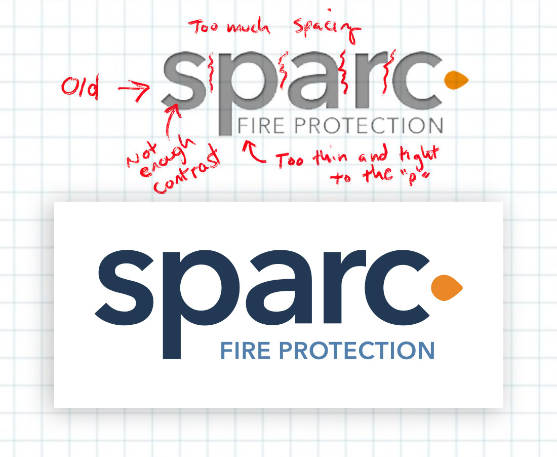
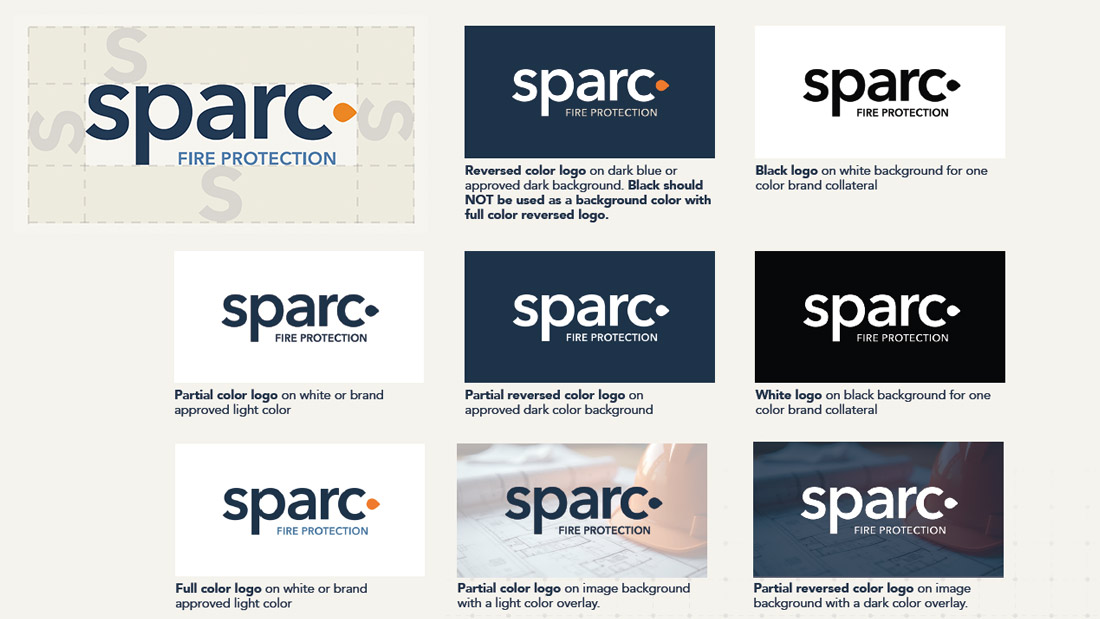
Good bones, weak execution. Proportions tightened, letterforms cleaned up, mark rebuilt to hold up at any size and on any background. Same identity. Sharper everywhere it counts.
Brand Refresh and Color System
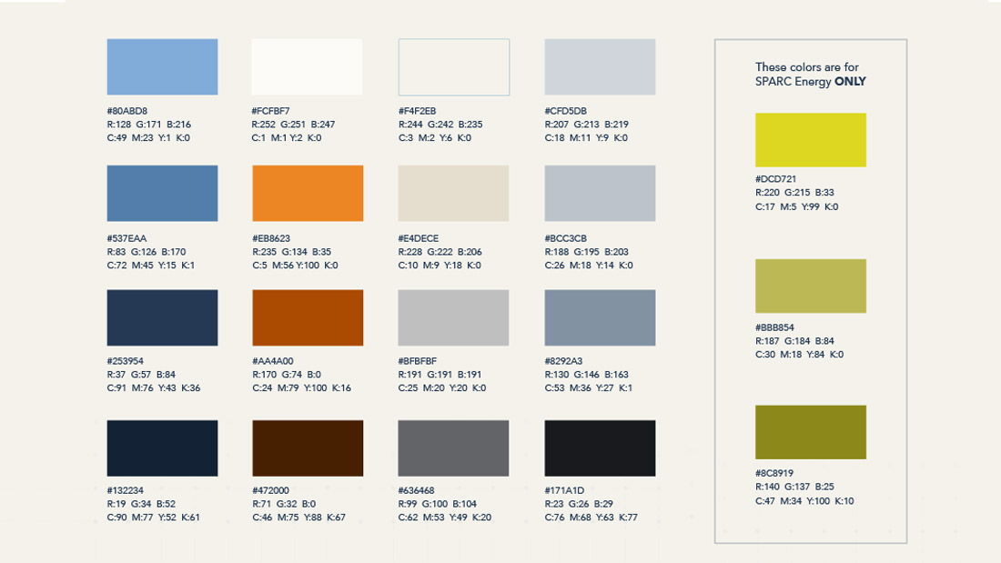
Flat, low contrast, out of step. The new system fixes all three. Stronger contrast, more modern tone, clear roles for every color so there’s no guesswork when it gets applied.
Brand Standards
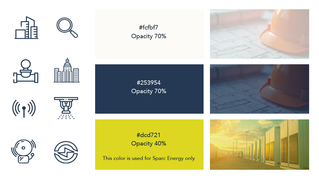
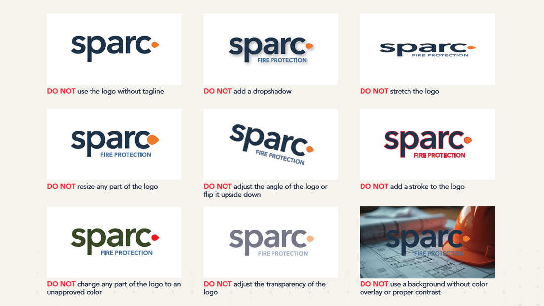
Logo usage, color values, typography, spacing rules. Everything the team needs to stay consistent without calling a designer every time.
Web Design
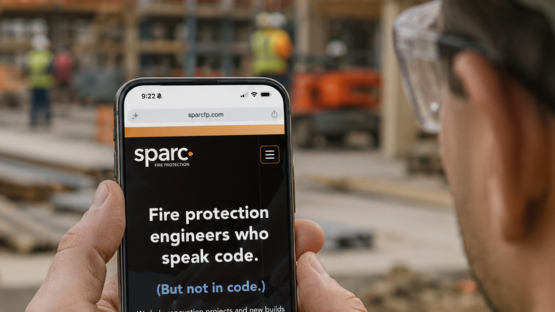
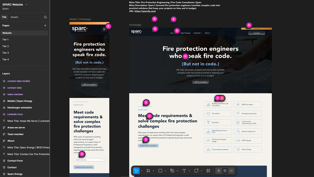
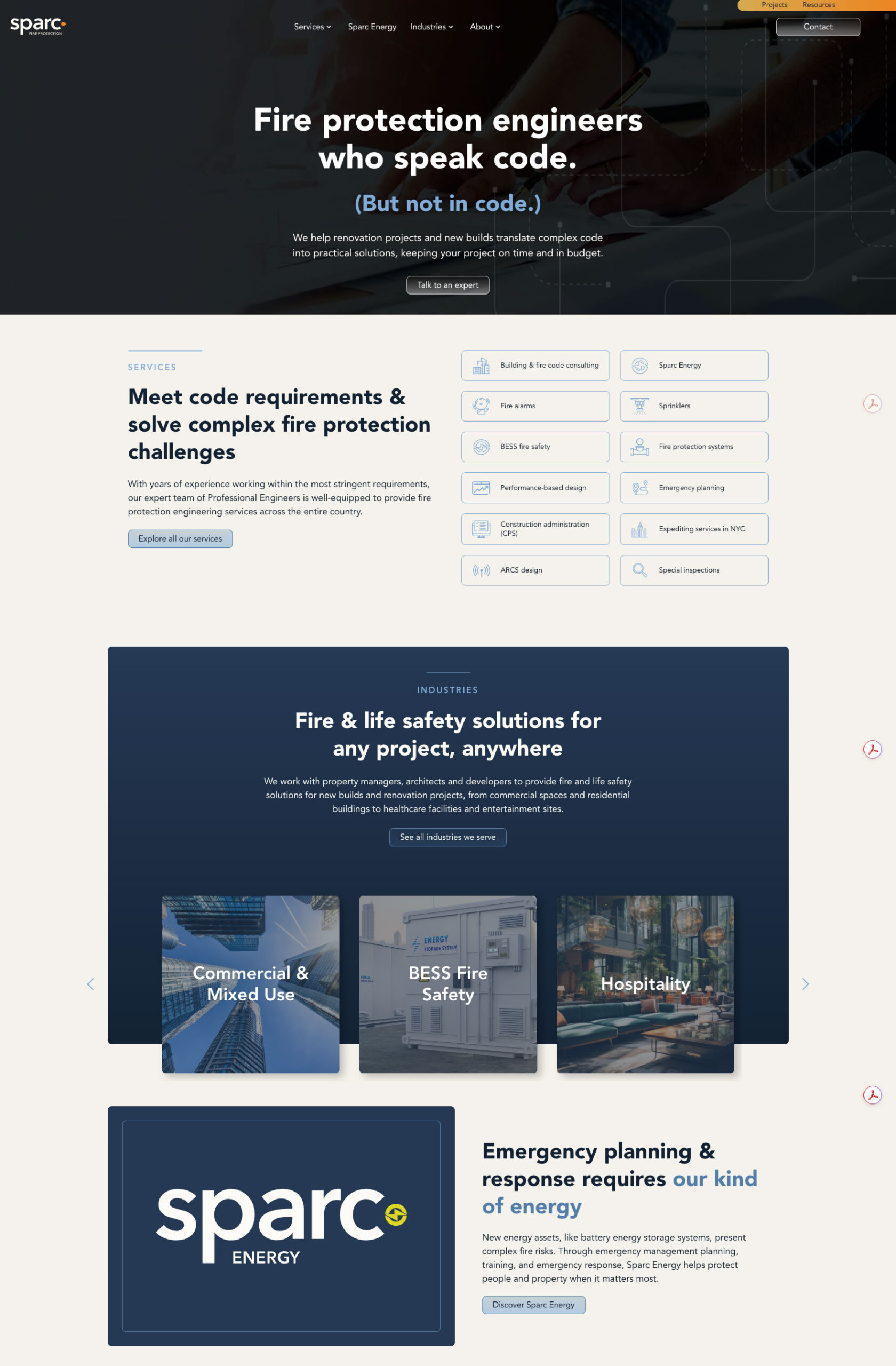
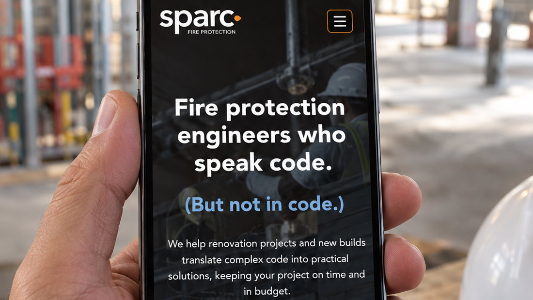
The old site buried everything that made this firm worth hiring. The new one leads with it. Designed in Figma across desktop and mobile, prototyped so the client could navigate the full experience before anything went to development.
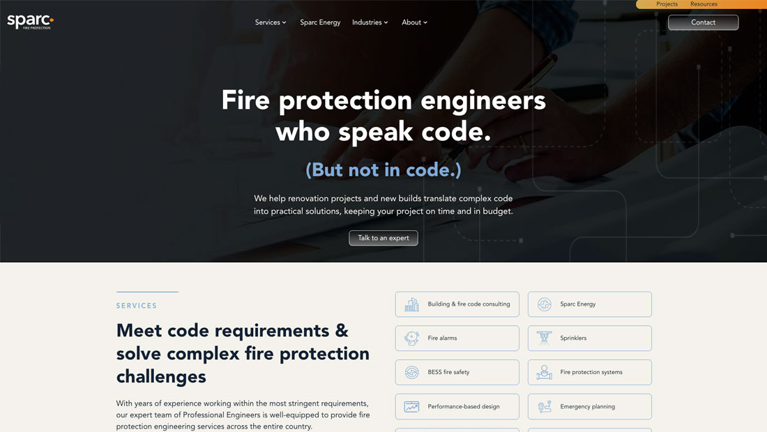
The Live Site
Clean, direct, and built to make a strong first impression on the kind of buyer who does their homework before they pick up the phone.
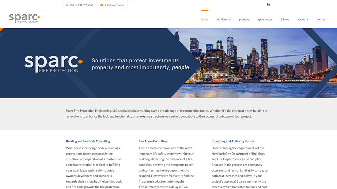
Old vs New Site
Hard to believe these are the same company. The old site said nothing about fifteen years of specialized expertise. The new one leads with it.
A brand and website that finally shows up the way the work does.
We use cookies to ensure that we give you the best experience on our website. If you continue to use this site we will assume that you are happy with it.