Product Branding, AI Product Visualization, Landing Page Design, Sub-Brand Identity
Overview and Challenge
A drone hardware company launching a new product before it existed. The audience: professional land surveyors — technical, skeptical, not easily impressed. The job was to build enough visual credibility to get that audience to hand over a pre-order. No hardware on the shelf. No photos. Just a name, a concept, and a deadline.
My Role
Sub-brand identity, product color direction, AI product visualizations, 3D mockup, and landing page design. Built to convert a tough audience on a product they couldn’t hold yet.
The Sub-Brand
The product name was already chosen — a nod to exploration, fitting for hardware built around precision navigation and survey-grade mapping. Orange was introduced as the signature color: bold, distinctive, and a clear departure from the grays and blacks that dominate drone hardware.
The Color Shift
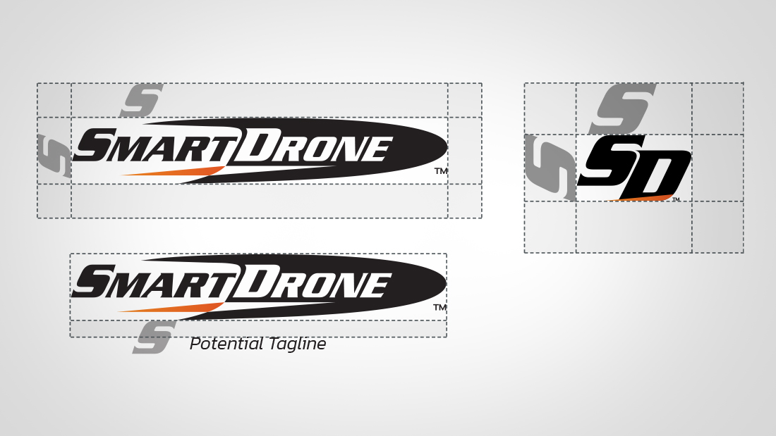
The parent brand got the orange treatment too. One color change across the existing logo tied the new product launch back to the broader brand family and signaled this wasn’t just a new product. It was a new chapter.
AI Product Visualization
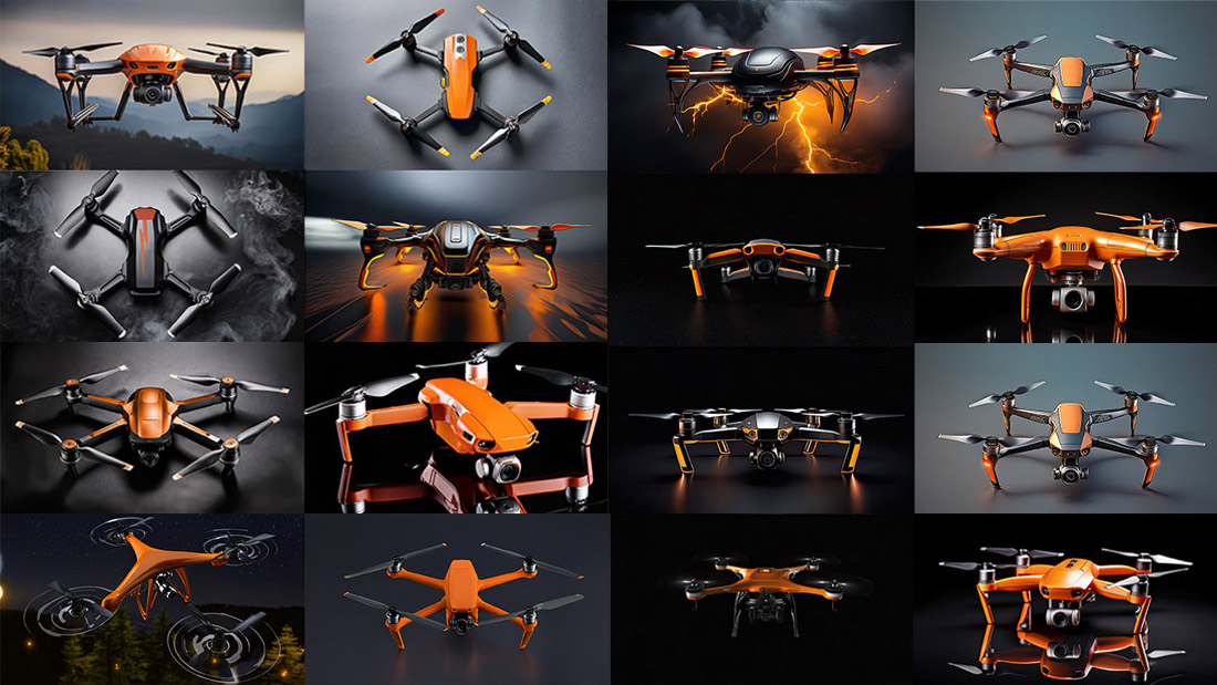
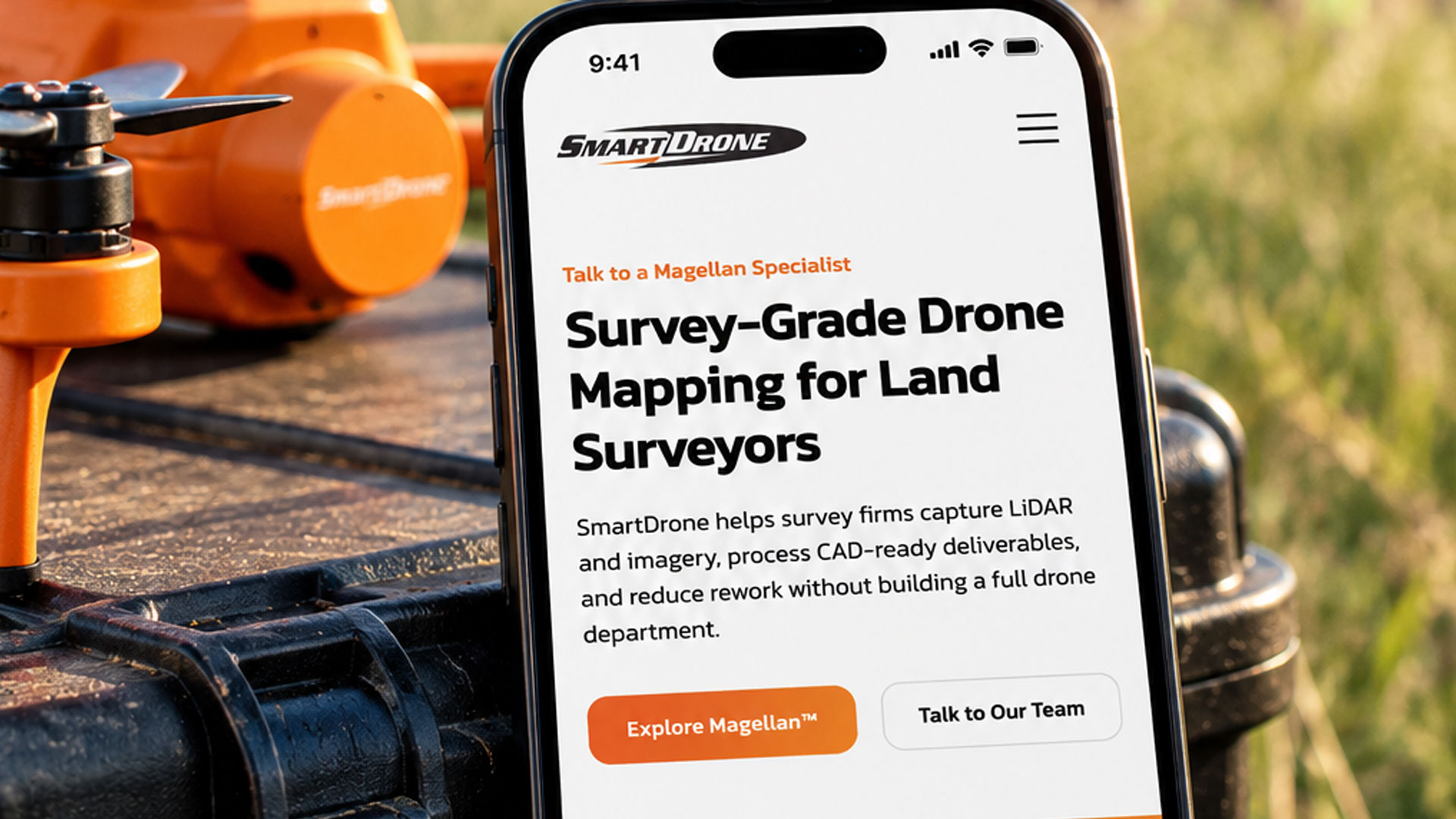
No finished product meant no photography. AI visualizations brought the drone to life in the orange colorway across multiple angles and real environments — polished enough to stand next to competitors who had years of product shots in the bank. This wasn’t a workaround. It was the strategy.
3D Product Mockup
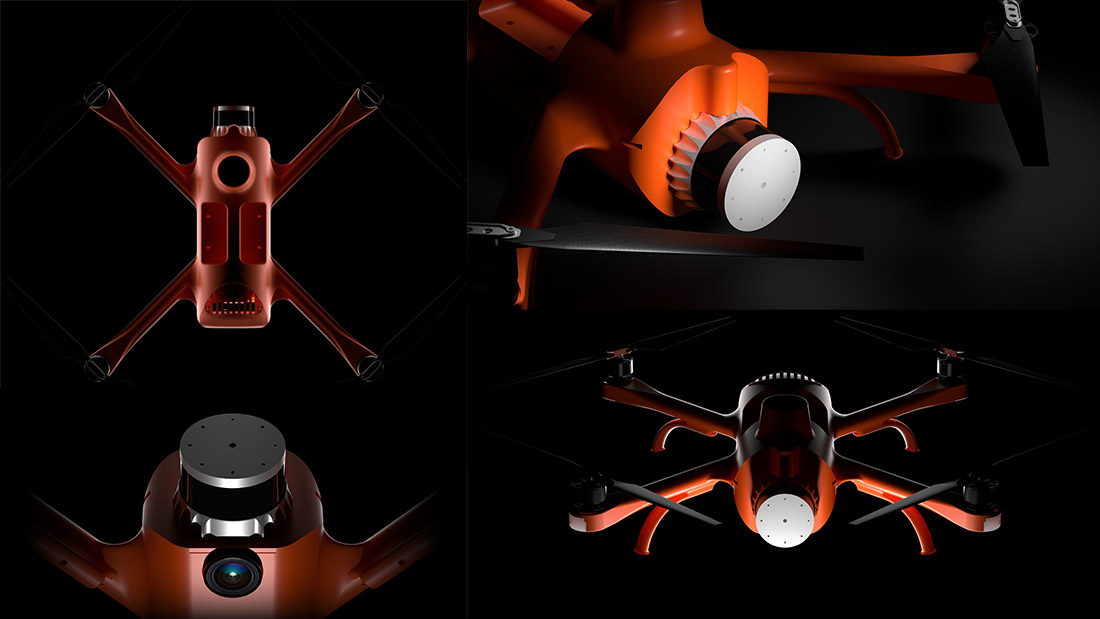
With the AI visuals establishing the look, a full 3D mockup added realism and technical credibility: precise angles, accurate proportions, surface detail. Something that felt tangible before the product existed in physical form.
Landing Page
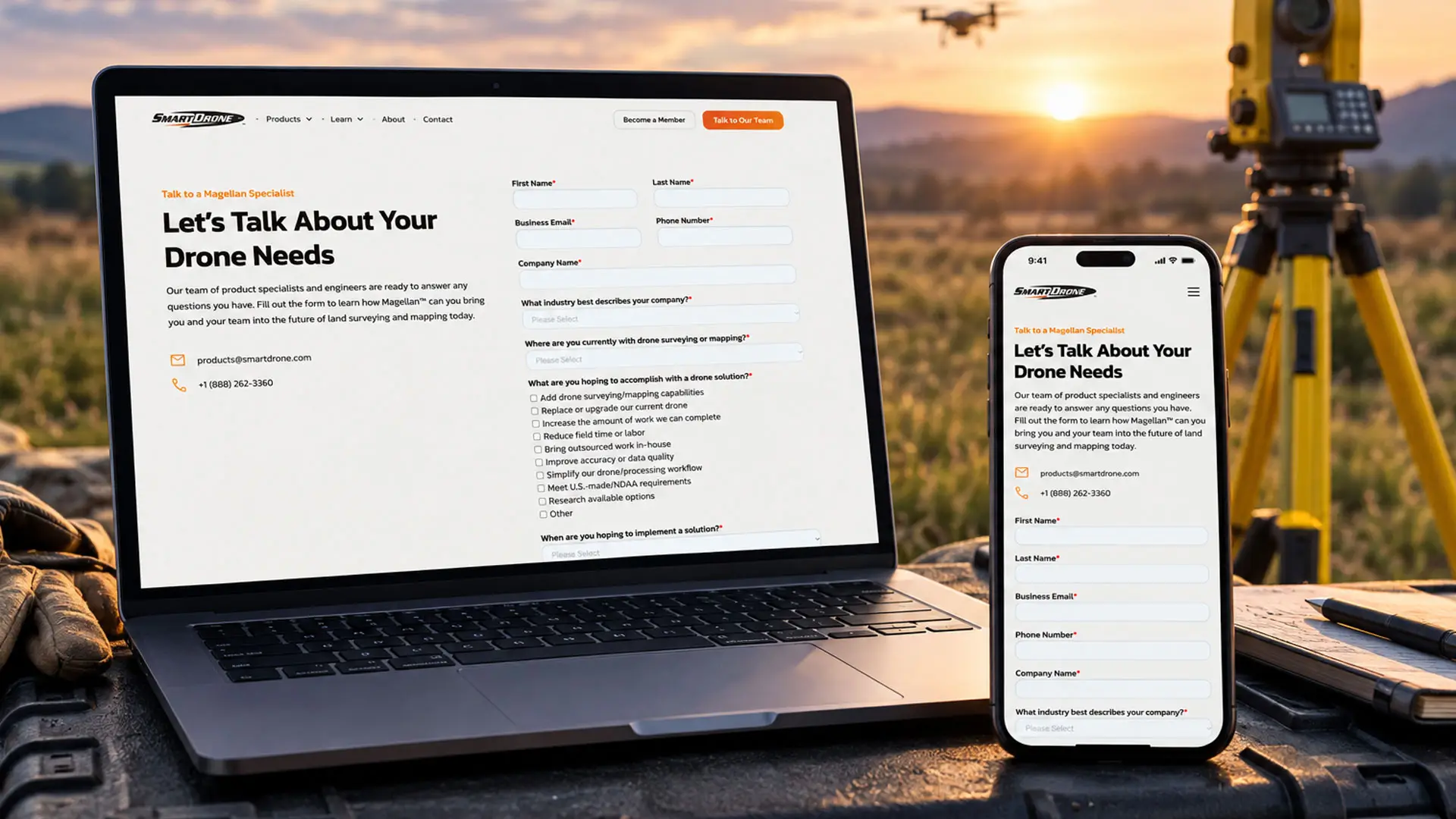
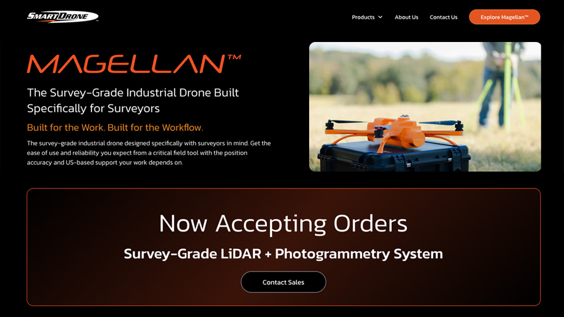
One page. One job. Get a skeptical land surveyor to commit to a pre-order for hardware that didn’t exist yet. The page led with the product visuals, told the brand story fast, laid out the specs clearly, and got out of the way.
UX Audit and Website Refresh
A full UX audit surfaced a significant issue: three different navigation bars across the site, each with its own structure. The whole thing was restructured down to one consistent nav with a new menu that worked everywhere. CTAs updated, new orange logo applied throughout. First time the site felt like one thing.
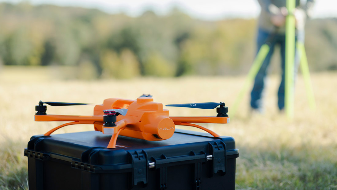
The product was eventually built. The finished drone matched the brand and color direction established from the start. From AI visualization to 3D mockup to physical hardware, the identity held up at every stage.
Print Collateral
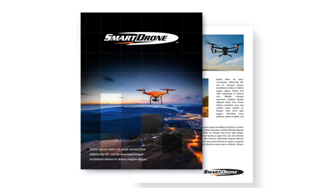
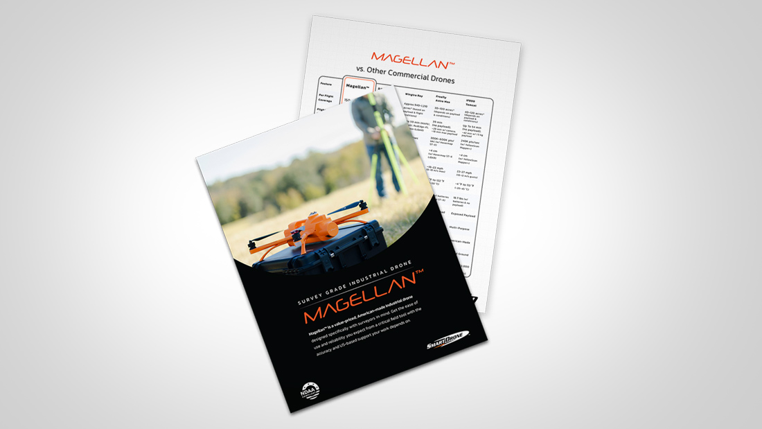
The brand extended into print: sales materials, product sheets, and collateral carrying the orange identity consistently into the hands of the people being sold to. A launch only works if every touchpoint tells the same story.
The Outcome
3 pre-orders before a unit came off the line. A brand built from nothing that converted a technical, skeptical audience on a concept alone.
We use cookies to ensure that we give you the best experience on our website. If you continue to use this site we will assume that you are happy with it.